SMS:Annotations
Annotations can be added to a project to provide notes and clarification. The annotations application is included in all paid editions of SMS.
Annotation Objects
The SMS applications contains tools to annotate the data in the application for presentations, animations and screen shots.
These tools (annotation objects) are accessed through the Annotations ![]() module and include:
module and include:
- Images
- North Arrows
- Scale Bars
- Text
- Lines
- Ovals
- Rectangles
Note that there is a limit of 100 annotation objects allowed in a single project.
Screen vs World Space Layers
All annotation layers contain objects referenced either to world or to screen coordinates. Objects referenced to world coordinates will change size and position on the screen with the underlying data. This is useful to identify specific locations in the model such as pier locations. Objects associated with screen coordinates do not move on the screen with the underlying data. This is useful for titles, legends such as north arrows and scale bars, and logos. Some types of annotations can only be created in screen space layers. These include North arrows, images, and scale bars.
When the first annotation object is created, the program will ask which type of layer (screen or world space) to create and add the object to. Create additional layers by right-clicking on the "![]() Annotation Data" item and selecting Create Screen Space Layer or Create World Space Layer. Layers are differentiated by their icons in the Project Explorer:
Annotation Data" item and selecting Create Screen Space Layer or Create World Space Layer. Layers are differentiated by their icons in the Project Explorer: ![]() for screen space layers or
for screen space layers or ![]() for world space layers.
for world space layers.
If multiple layers exist, any newly created annotation object will be placed in the active layer.
Annotation Object Properties
The extents of many annotation objects are defined by a frame. Define this frame when creating the annotation object by clicking at any point on the screen and dragging a rectangle with the mouse (left button still down). The display will show the frame while dragging with the mouse. (Points and lines defining degenerate frames are not allowed.)
When creating an annotation, if the frame is too big for the window, it will be resized appropriately. Annotations on a screen space layer can't be resized or moved even partially outside of the borders of the Graphics Window. If, through a quick mouse drag, resizing such an annotation causes the cursor to land outside the window, the annotation will be redrawn to take up all the window space in that direction.
This frame bounds the region of the Graphics Window where the object will appear with the modeling data. Interact with the object by interacting with its frame and specifying its properties (see the section on selection below). The frame anchors the annotation object in the Graphics Window. This anchoring defines both the size and position of the object.
All annotation objects also have properties. The specific properties depend on the type of object. The properties define color, line thickness, fill properties, associated images, etc.
Anchor Tab
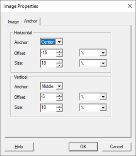
For screen space annotation objects, the x-location, y-location, x-size, and y-size are all defined independently as either a pixel value or percentage of the Graphics Window. These values can be seen and edited in the Anchor tab of the properties dialog. Adjusting these values changes the location of the object in the Graphics Window. Likewise, adjusting the location of an object in the Graphics Window changes these values. Since objects in a world space layer are anchored through reference to world coordinates, they do not have an Anchor tab.
The horizontal position can be set from the left edge, the right edge or the center of the object. If positioning the left edge, the object position is defined relative to the left edge of the Graphics Window. If positioning the right edge, the object position is defined relative to the right edge of the Graphics Window. If positioning the center of the object, the object position is defined relative to the horizontal center of the Graphics Window.
For example, the left side of the frame may be specified as 100 pixels from the left edge of the Graphics Window. Alternatively, specify that the right edge of the frame should be 10% of the Graphics Window width from the right edge. Finally, specify that the center of the object is 100 pixels to the right of the center of the Graphics Window. Notice the effects.
The active Anchor setting also determines how the size of an object is adjusted. If the object is anchored from the left edge, the right edge will move when the size is adjusted. If the object is anchored from the right edge, the left edge will move when the size is adjusted. If the object is anchored from the center, both edges of the image will move when the size is adjusted. In other words, SMS adjusts the size of the object in a way that maintains the position defined using the anchor and the offset.
However, screen space annotation objects cannot extend beyond the limits of the Graphics Window. If the size is adjusted in a way that makes it impossible to maintain the defined offset, SMS will edit the offset to achieve the desired size. For example, an object anchored to the left with an offset of 16% can have a size of 25% of the Graphics Window. However, setting the size to 85% of the Graphics Window causes SMS to edit the offset to be 15% of the Graphics Window. Since the size is 85% of the Graphics Window, there is less room for an offset, and it is set to 15%.
In like manner, SMS will round any impossible input to the nearest possible number. So, if the size is set to 101% of the Graphics Window, SMS will change it to 100 when OK is clicked in the properties dialog. When the dialog is opened again, 100 will be in the Size setting.
The vertical position and sizes of objects are similarly specified in the anchoring tab of the object.
The following is a list of all the options on the Anchor tab:
The following is a list of all the options on the Anchor tab:
- Horizontal
- Anchor – The options here determine which direction to move an image when moving or resizing the image along the x-axis. Options include "Left", "Center", and "Right". "Left" will offset from the left edge of the image or resize from the left edge. "Right" will use the right edge of the image. "Center" determines the horizontal center of the image and uses that for moving along the x-axis or resizing along the x-axis.
- Offset – Moves the image along the x-axis based on the selected anchor type. Use the drop-down menu to the right to select the measurement to use in determining the anchor. Changing the measurement units (i.e. percentage or pixels) in the drop-down menu to the right converts the number for this option to reflect the new measurement.
- "%" – Sets the measurement unit for the x-offset to be a percentage of the Graphics Window.
- "Pixels" – Sets the measurement unit for the x-offset to be a number of pixels.
- Size – Increases or decreases the image size along the x-axis based on the selected anchor type. Changing the measurement units (i.e. percentage or pixels) in the drop-down menu to the right converts the number for this option to reflect the new measurement.
- "%" – Sets the measurement unit for the x-size to be a percentage of the Graphics Window.
- "Pixels" – Sets the measurement unit for the x-size to be a number of pixels.
- Vertical
- Anchor – The options here determine which direction to move the image when moving or resizing the image along the y-axis. Options include "Top", "Middle", and "Bottom". "Top" will offset from the top edge of the image or resize from the top edge. "Bottom" will use the bottom edge of the image. "Middle" determines the vertical center of the image and uses that for moving along the y-axis or resizing along the y-axis.
- Offset – Moves the image along the y-axis based on the selected anchor type.
- "%" – Sets the measurement unit for the y-offset to be a percentage of the Graphics Window.
- "Pixels" – Sets the measurement unit for the y-offset to be a number of pixels.
- Size – Increases or decreases the image size along the y-axis based on the selected anchor type. Changing the measurement units (i.e. percentage or pixels) in the drop-down menu to the right converts the number for this option to reflect the new measurement.
- "%" – Sets the measurement unit for the y-size to be a percentage of the Graphics Window.
- "Pixels" – Sets the measurement unit for the y-size to be a number of pixels.
Annotation Object Display Order
Within a single annotation layer, objects are displayed in the order they are drawn with newer objects being displayed on top of older objects.
When there are multiple annotation layers, the display order of the layers is controlled in the Project Explorer. For example, the annotation objects for layer #1 are displayed above annotation objects for layer #2 when that layer #1 is positioned below the layer #2 in the Project Explorer. Annotation layers can be rearranged in the Project Explorer by clicking-and-dragging the layer above or below the other annotation layers. It does not matter if the layers are in world space or screen space.
Screen Space Images
A screen space image is simply a graphics icon mapped to the Graphics Window. A typical application would be to display a company, department, or municipality logo next to the numeric model being displayed in the Graphics Window. Image file formats currently supported include the following: BMP, GIF, JPG/JPEG, PNG, SID, and TIF/TIFF.
To add a screen space image, use the Add Annotation Image ![]() tool and click anywhere in the graphics window. Use the Open dialog to select and add the desired image. Dragging a box in the Graphics Window will fit the image to the box size.
tool and click anywhere in the graphics window. Use the Open dialog to select and add the desired image. Dragging a box in the Graphics Window will fit the image to the box size.
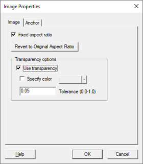
Using the Select Annotation Objects ![]() tool, the image attributes can be changed by right-clicking on the image and selecting the Properties command. This will bring up an Image Properties dialog with two tabs where the following options can be used:
tool, the image attributes can be changed by right-clicking on the image and selecting the Properties command. This will bring up an Image Properties dialog with two tabs where the following options can be used:
Image Tab
This tab gives the general image properties.
- Fixed aspect ratio – Assigns whether the image is being displayed as a scaled (distorted object), scaled based on its original aspect ratio, or locked at another aspect ratio.
- Revert to Original Aspect Ratio – Returns the image to the aspect ratio it had when it was added to the project.
- Transparency Options – These options allow for an image to be redrawn with a transparency.
- Use transparency – When checked it will cause the image to be redrawn with the most used color in the image. Clicking the transparency checkbox to the off state causes the image to be redrawn with no transparency.
- Specify color – Activates the color button and the color button will have the latest chosen image color painted on it or the most used color in the image, if it has not been activated before. Clicking on the down arrow part of the color button causes a color popup to be displayed with swaths of the 40 most used colors in the image or all the colors in the image, if the image has less than 40 colors. Clicking on one of those colors will cause the image to be redrawn with that color made transparent in the image.
- Tolerance – This edit field allows for variation in the matching of the red, green and blue components. The tolerance field ranges in allowable values from 0.0 to 1.0. 0.0 means the red, green and blue components must exactly match. Values higher than 0.0 indicate the degree of variation from the given color.
- Anchor tab – Screen space image objects also always have an anchor tab with options as described above.
Scale Bars
A scale bar occupies a fixed size of the screen to display the relative size of the objects in the simulation. Define the minimum width of the scale bar section (in pixels), along with a minimum and maximum height of the scale (also in pixels). The XMS application adds a "Units" label (meters in the image shown below) and labels for the model distance related to the scale divisions.
The program will compute a well conditioned number to use as the scale increment that fits in the specified scale bar extents.
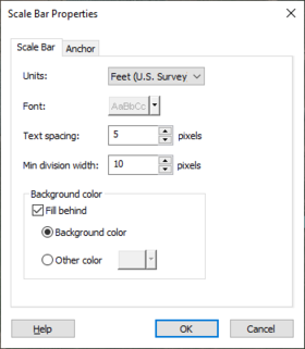
Using the Create Scale Bar ![]() tool, draw a box in the Graphics Window to indicate the initial size of the scale bar. The Scale Bar Properties dialog will appear. This dialog can be reached later by right-clicking on the scale bar and selecting the Properties command.
tool, draw a box in the Graphics Window to indicate the initial size of the scale bar. The Scale Bar Properties dialog will appear. This dialog can be reached later by right-clicking on the scale bar and selecting the Properties command.
In the Scale Bar Properties dialog, attributes of the scale bar include:
- Units – Options in "Meters", "Feet (U.S. Survey)", and "Feet (International)".
- Font – Selecting this button bring ups the Font dialog where the font type, style, and size are selected. The arrow next to the button will bring up a color picker where the font color can be chosen.
- Text spacing – The minimum spacing between distance labels.
- Min division width – The minimum division width (in pixels). The XMS application determines the number of divisions based on the minimum division width and the width of the frame.
- Background – Options to fill behind the scale bar with the background color or another color.
- Fill behind – Turns on or off the option to create a colored field behind the scale bar.
- Background color – Sets the background color as the same background color selected for the Graphics Window in the Display Options dialog.
- Other color – Clicking this button will bring up a Color dialog where a larger selection of colors can be chosen. The arrow next to the button will bring up a color picker with a preset number of color options.
- Anchor tab – Scale bar objects also always have an anchor tab with options as described above.
North Arrows
North arrow objects consist of automatically rotating screen space images. When an XMS application is installed, at least one default north arrow image will be included in the application's home directory, and many are included in the SMS "SupportFiles" folder. Create or download as many north arrow icons as desired. These icons are displayed at the specified location (anchored with the standard options), but will rotate as the view direction changes so that the "up" direction of the icon always aligns with the "North" or positive "Y" direction.
A north arrow object is added by using the Create North Arrow ![]() tool. Properties for a north arrow objects are set in the North Arrow Properties dialog. This dialog has the same options as the Image Properties dialog.
tool. Properties for a north arrow objects are set in the North Arrow Properties dialog. This dialog has the same options as the Image Properties dialog.
Text
Text can be created in world or screen space layers.
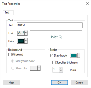
Enter text by clicking in the Graphics Window with the Create Text ![]() tool active. This will bring up the Text Properties dialog. In this dialog, the attributes for the text object can be defined.
tool active. This will bring up the Text Properties dialog. In this dialog, the attributes for the text object can be defined.
The following text attributes can be set:
- Text – Options for specifying the text to be displayed and font style.
- Text – Field where the text to be displayed is entered.
- Font – Selecting this button bring ups the Font dialog where the font type, style, and size are selected. The arrow next to the button will bring up a color picker where the font color can be chosen.
- Color – Another method for selecting the font color. Clicking this button will bring up a Color dialog where a larger selection of colors can be chosen. The arrow next to the button will bring up a color picker identical to the one above.
- Background – Fill behind the text with the background color or another color.
- Background color – Sets the background color as the same background color selected for the Graphics Window in the Display Options dialog.
- Other color – Activates color button identical to the one in the Text section.
- Border – Contains option for defining a border around the text object.
- Draw border – Activates a border around the entire text object. The color button allows changing the border color.
- Specified thickness – Activates the option to change the border thickness. The default border thickness is 1 pixel.
- Anchor tab – When text objects are in a screen space layer, they also have an anchor tab with options as described above.
Lines/Arrows
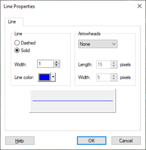
Create lines or arrows using the Create Line ![]() tool. Lines/arrows can be created in screen or world space layers. Lines can be straight or curved. Click once to start a line. Click again to curve the line. Double-click or hit enter to complete a line. Once the line has been completed, the Line Properties dialog will appear. This dialog can also be accessed by right-clicking on the line and selecting the Properties command.
tool. Lines/arrows can be created in screen or world space layers. Lines can be straight or curved. Click once to start a line. Click again to curve the line. Double-click or hit enter to complete a line. Once the line has been completed, the Line Properties dialog will appear. This dialog can also be accessed by right-clicking on the line and selecting the Properties command.
In the Line Properties dialog, the attributes available for lines and arrows include:
- Line – Attributes for a line include:
- Dashed – Sets the line as an evenly spaced dashed line. The length of each dash and the length of each space is a set value that cannot be changed at this time.
- Solid – Specifies the line as a solid line.
- Width – Specifies the line width.
- Line Color – Clicking this button will bring up a Color dialog where a larger selection of colors can be chosen. The arrow next to the button will bring up a color picker with preset color options.
- Arrowheads – This section has options for making the line into an arrow.
- Location – Drop-down menu that defines where the arrow head will be placed on the line. "None" will leave off arrowheads. "Begin" places the arrowhead where the line was started when created. "End" places the arrowhead where the line terminated during creation. "Both" places an arrowhead at the start and end of the line.
- Length – Defines the length of the arrowhead. The point of the arrowhead will not go past the start or end point of the line. Increasing the size will move arrowhead further up or down the line.
- Width – Defines the arrowhead width. The arrowhead width will be equally divided along either side of the line.
- Preview – Shows what the line or arrow will look like with the current selected options. Options are not applied until the OK button is clicked.
- Anchor tab – When lines/arrows are in a screen space layer, they also have an anchor tab with options as described above.
Rectangles and Ovals
Create rectangles by dragging a box with Create Rectangle ![]() tool active and create ovals with the Create Oval
tool active and create ovals with the Create Oval ![]() tool active. Rectangles or ovals can be created in world or screen space layers.
tool active. Rectangles or ovals can be created in world or screen space layers.
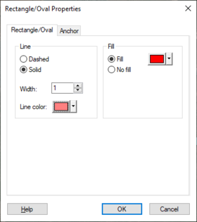
After designating where the rectangle or oval will be drawn, the Rectangle/Oval Properties dialog will appear. This is the same dialog for both rectangles and ovals. It can also be accessed by right-clicking on the rectangle or oval and selecting the Properties command.
In the Rectangle/Oval Properties dialog, the attributes for rectangles and ovals include:
- Line – Attributes for a line around the rectangle or oval. Options include:
- Dashed – Sets the line as an evenly spaced dashed line. The length of each dash and the length of each space is a set value that cannot be changed at this time.
- Solid – Specifies the line as a solid line.
- Width – Specifies the line width.
- Line Color – Clicking this button will bring up a Color dialog where a larger selection of colors can be chosen. The arrow next to the button will bring up a color picker with preset color options.
- Fill
- Fill – Designates that the area of the rectangle or oval will have a solid color. This activates a color button like the one in the Line section.
- No fill – Designates that the area of the rectangle or oval will be empty.
- Anchor tab – When rectangles and ovals are in a screen space layer, they also have an anchor tab with options as described above.
Selection
The Select Annotation Object ![]() tool is used to select and set attributes for annotation objects. This requires that objects exist to be selected. Left-click in the annotation object for the object frame to be drawn around the annotation. In addition to the frame, the XMS application displays grab handles on the corners and edges of the frame. Modify the rectangular shape of the annotation by dragging one of the grab handles. Change the position of the object by dragging the annotation (click at any point in the object interior).
tool is used to select and set attributes for annotation objects. This requires that objects exist to be selected. Left-click in the annotation object for the object frame to be drawn around the annotation. In addition to the frame, the XMS application displays grab handles on the corners and edges of the frame. Modify the rectangular shape of the annotation by dragging one of the grab handles. Change the position of the object by dragging the annotation (click at any point in the object interior).
Right-clicking on an annotation object will produce a menu with the following commands:
- Delete – Removes the annotation object.
- Duplicate – Creates a copy of the annotation object on the same annotation layer.
- Properties – Brings up the properties dialog for the selected object.
Viewing Annotations At Specific Time Intervals
Available in SMS v11.1 and higher, annotations can be setup to be viewed at specific time intervals. To setup annotations so they only are displayed at specified time intervals do the following:
- Right-click on the annotation layer in the Project Explorer then select Properties... to open the Annotation Layer dialog.
- Check the Apply time range checkbox
- Modify the Begin and End time controls to specify the range for when annotations are visible.
- Click OK to set the time intervals and close the dialog.
Annotations will not be displayed when the specified time range is active. This applies to data in the Graphics Window and film loops.
See also
SMS Toolbars | |
|---|---|
| Standard Toolbars: | Data • Macros (Display, File, Optional Macro) • Module Toolbar • Static Tools |
| Dynamic Tools | 1D Grid • 2D Mesh Module • Annotations • Cartesian Grid Module • Curvilinear Grid • GIS Module • Map Module • Particle Module • Quadtree • Scatter Module |
| Quick Tour • Layout | |

