Polygon Symbolizer Properties: Difference between revisions
| (3 intermediate revisions by the same user not shown) | |||
| Line 78: | Line 78: | ||
****''Line Caps'' – Section includes options for both ''Start Cap'' and ''End Cap'' at each end of the line. Both options can be set to: "Flat", "Round", "Square", "Triangle", "No Anchor", "Square Anchor", "Round Anchor", "Diamond Anchor", "Arrow Anchor", "Anchor Mask", and "Custom". | ****''Line Caps'' – Section includes options for both ''Start Cap'' and ''End Cap'' at each end of the line. Both options can be set to: "Flat", "Round", "Square", "Triangle", "No Anchor", "Square Anchor", "Round Anchor", "Diamond Anchor", "Arrow Anchor", "Anchor Mask", and "Custom". | ||
****''Line Joins'' – Section includes options for how the border line in a polygon meet. Options include" ''Miter'', ''Round'', and ''Bevel''. | ****''Line Joins'' – Section includes options for how the border line in a polygon meet. Options include" ''Miter'', ''Round'', and ''Bevel''. | ||
***''Template'' – This tab presents a grid where the width and dash spacing can be specified. The width of the line can be increased by dragging the vertical arrow down or up. The line width can be separated into multiple lines by selecting a row to make it inactive and thus creating a space between lines. The horizontal arrow can be dragged left or right to increase the dash width. Spaces between dashes can be added by selecting a column to make it inactive. | ***''Template'' – This tab presents a grid where the width and dash spacing can be specified. The width of the line can be increased by dragging the vertical arrow down or up. The line width can be separated into multiple lines by selecting a row to make it inactive and thus creating a space between lines. The horizontal arrow can be dragged left or right to increase the dash width. Spaces between dashes can be added by selecting a column to make it inactive.[[File:LineDecorationsTab.png|thumb|400 px|The ''Line Decorations'' tab]] | ||
[[File:LineDecorationsTab.png|thumb|400 px|The ''Line Decorations'' tab]] | ***''Line Decorations'' – This tab has several options for specifying a symbol at the each line end. Options include: | ||
**''Line Decorations'' – This tab has several options for specifying a symbol at the each line end. Options include: | ****''Layer List'' – On the left of the tab is an unlabeled list of currently-defined property sets for the line decoration. The property sets are layered, allowing the sets to be combined if the opacity settings and positioning are set correctly. Clicking the add [[File:AddButton.png|14 px]] button adds an additional layer to the list. The up and down arrow [[File:UpDownButtons.png|31 px]] buttons move the selected layer above or below the other layers. The delete [[File:X button.png|14 px]] button removes the selected property set. | ||
***''Layer List'' – On the left of the tab is an unlabeled list of currently-defined property sets for the line decoration. The property sets are layered, allowing the sets to be combined if the opacity settings and positioning are set correctly. Clicking the add [[File:AddButton.png|14 px]] button adds an additional layer to the list. The up and down arrow [[File:UpDownButtons.png|31 px]] buttons move the selected layer above or below the other layers. The delete [[File:X button.png|14 px]] button removes the selected property set. | ****''Position Options'' – Section allows defining the placement of the line decorations. Options include: | ||
***''Position Options'' – Section allows defining the placement of the line decorations. Options include: | *****''Number of Positions'' – Specifies how often the line decoration symbol repeat along the border line. | ||
****''Number of Positions'' – Specifies how often the line decoration symbol repeat along the border line. | *****''Flip All'' check box – Inverts the symbol position for all instances of the symbol on the line. | ||
****''Flip All'' check box – Inverts the symbol position for all instances of the symbol on the line. | *****''Flip First'' check box – Inverts the symbol position for the first instance symbol on the line. | ||
****''Flip First'' check box – Inverts the symbol position for the first instance symbol on the line. | *****''Offset'' – Moves the symbol off of the line center. Both positive and negative values are accepted. | ||
****''Offset'' – Moves the symbol off of the line center. Both positive and negative values are accepted. | *****''Percentual position'' – Treats the entire line as 0% to 100% and sets the location of the symbol based on the percentage entered. This option is only visible when ''Number of Positions'' is set to "1". | ||
****''Percentual position'' – Treats the entire line as 0% to 100% and sets the location of the symbol based on the percentage entered. This option is only visible when ''Number of Positions'' is set to "1". | ****''Rotation'' | ||
***''Rotation'' | *****''Rotate symbol to follow line angle'' | ||
****''Rotate symbol to follow line angle'' | *****''Keep symbol at fixed angle to page'' | ||
****''Keep symbol at fixed angle to page'' | ****''Symbol'' – Gives a preview of the current symbol. Clicking the '''Edit''' button brings up the ''Point Symbolizer Dialog'' where the symbol decoration can be defined. | ||
***''Symbol'' – Gives a preview of the current symbol. Clicking the '''Edit''' button brings up the ''Point Symbolizer Dialog'' where the symbol decoration can be defined. | |||
===Point Symbolizer Dialog=== | ===Point Symbolizer Dialog=== | ||
| Line 97: | Line 96: | ||
Provides additional options for symbols when using the line decoration options in the ''Line Symbol'' dialog. | Provides additional options for symbols when using the line decoration options in the ''Line Symbol'' dialog. | ||
*''Layer List'' | *''Layer List'' | ||
::On the left of the dialog is a list of currently defined property sets for the symbol. The property sets are layered, allowing the sets to be combined if the opacity settings are set correctly. Clicking the add [[File:AddButton.png|14 px]] button adds an additional layer to the list. The up and down arrow [[File:UpDownButtons.png|31 px]] buttons move the selected layer above or below the other layers. The delete [[File:X button.png|14 px]] button removes the selected property set. | |||
On the left of the dialog is a list of currently defined property sets for the symbol. The property sets are layered, allowing the sets to be combined if the opacity settings are set correctly. Clicking the add [[File:AddButton.png|14 px]] button adds an additional layer to the list. The up and down arrow [[File:UpDownButtons.png|31 px]] buttons move the selected layer above or below the other layers. The delete [[File:X button.png|14 px]] button removes the selected property set. | |||
*''Symbolizer Characteristics'' | *''Symbolizer Characteristics'' | ||
**''Scale Model'' drop-down – Options include: "Simple", "Symbolic", and "Geographic". | |||
*''Scale Model'' drop-down – Options include: "Simple", "Symbolic", and "Geographic". | **''Smoothing'' check box – When checked on, automatically adjusts the image values to present a cleaner image. | ||
*''Smoothing'' check box – When checked on, automatically adjusts the image values to present a cleaner image. | **''Units'' drop-down – Options include: "Display", "Document", "Inch", "Millimeter", "Pixel", "Point", and "World". | ||
*''Units'' drop-down – Options include: "Display", "Document", "Inch", "Millimeter", "Pixel", "Point", and "World". | **''Preview'' – Shows how the symbol appears with the currently-selected options. | ||
*''Preview'' – Shows how the symbol appears with the currently-selected options. | |||
*'''Add to Custom Symbols''' button – Adds the symbol to the list of custom symbols. | *'''Add to Custom Symbols''' button – Adds the symbol to the list of custom symbols. | ||
*''Symbol Type'' drop-down – Select the type of symbol desired: | *''Symbol Type'' drop-down – Select the type of symbol desired: | ||
**"Simple" – Uses a simple shape as the symbol. Options include: | |||
*"Simple" – Uses a simple shape as the symbol. Options include: | ***''Style'' drop-down – Provides simple shapes. Options include: "Diamond", "Hexagon", "Ellipse", "Pentagon", "Rectangle", "Star", and "Triangle". | ||
***''Color'' – Specifies the color of the symbol. Clicking on this button brings up a ''Color'' dialog. | |||
*''Style'' drop-down – Provides simple shapes. Options include: "Diamond", "Hexagon", "Ellipse", "Pentagon", "Rectangle", "Star", and "Triangle". | ***''Opacity'' – Moving the slider sets the opacity of the symbol. "0" equals no opacity or completely transparent. "1" equals a opacity of 100%. | ||
*''Color'' – Specifies the color of the symbol. Clicking on this button brings up a ''Color'' dialog. | ***''Use Outline'' check box – Checking this box places a line around the border of the symbol. | ||
*''Opacity'' – Moving the slider sets the opacity of the symbol. "0" equals no opacity or completely transparent. "1" equals a opacity of 100%. | ***''Outline Width'' – Specifies the thickness of the border line in pixels. | ||
*''Use Outline'' check box – Checking this box places a line around the border of the symbol. | ***''Outline Color'' – Specifies the color of the symbol border line. Clicking on this button brings up a ''Color'' dialog. | ||
*''Outline Width'' – Specifies the thickness of the border line in pixels. | ***''Outline Opacity'' – Moving the slider sets the opacity of the symbol border line. "0" equals no opacity or completely transparent. "1" equals a opacity of 100%. | ||
*''Outline Color'' – Specifies the color of the symbol border line. Clicking on this button brings up a ''Color'' dialog. | **"Character" – Uses a character as the symbol. Options include: | ||
*''Outline Opacity'' – Moving the slider sets the opacity of the symbol border line. "0" equals no opacity or completely transparent. "1" equals a opacity of 100%. | ***''Color'' – Specifies the color of the character symbol. Clicking on this button brings up a ''Color'' dialog. | ||
***''Opacity'' – Moving the slider sets the opacity of the character symbol. "0" equals no opacity or completely transparent. "1" equals a opacity of 100%. | |||
*"Character" – Uses a character as the symbol. Options include: | ***''Font Family'' drop-down – A list of available fonts for the character symbol. | ||
***''Character Keyboard'' – A scrollable list of characters available for the selected font. Click on a character to use it. | |||
*''Color'' – Specifies the color of the character symbol. Clicking on this button brings up a ''Color'' dialog. | ***''Unicode'' – Enter a unicode number to use a unicode character. | ||
*''Opacity'' – Moving the slider sets the opacity of the character symbol. "0" equals no opacity or completely transparent. "1" equals a opacity of 100%. | **"Picture" – Uses an image as the symbol. Options include: | ||
*''Font Family'' drop-down – A list of available fonts for the character symbol. | ***''Image'' – Clicking the [[File:EllipsesButton.png]] button brings up a file browser where an image file (BMP, GIF, JPEG, PNG, TIFF, or ICO) can be specified for the symbol. | ||
*''Character Keyboard'' – A scrollable list of characters available for the selected font. Click on a character to use it. | ***''Image Opacity'' – Moving the slider sets the opacity of the image. "0" equals no opacity or completely transparent. "1" equals a opacity of 100%. | ||
*''Unicode'' – Enter a unicode number to use a unicode character. | ***''Use Outline'' check box – Checking this box places a line around the border of the symbol. | ||
***''Outline Width'' – Specifies the thickness of the border line in pixels. | |||
*"Picture" – Uses an image as the symbol. Options include: | ***''Outline Color'' – Specifies the color of the symbol border line. Clicking on this button will bring up a ''Color'' dialog. | ||
***''Outline Opacity'' – Moving the slider sets the opacity of the symbol border line. "0" equals no opacity or completely transparent. "1" equals a opacity of 100%. | |||
*''Image'' – Clicking the [[File:EllipsesButton.png]] button brings up a file browser where an image file (BMP, GIF, JPEG, PNG, TIFF, or ICO) can be specified for the symbol. | |||
*''Image Opacity'' – Moving the slider sets the opacity of the image. "0" equals no opacity or completely transparent. "1" equals a opacity of 100%. | |||
*''Use Outline'' check box – Checking this box places a line around the border of the symbol. | |||
*''Outline Width'' – Specifies the thickness of the border line in pixels. | |||
*''Outline Color'' – Specifies the color of the symbol border line. Clicking on this button will bring up a ''Color'' dialog. | |||
*''Outline Opacity'' – Moving the slider sets the opacity of the symbol border line. "0" equals no opacity or completely transparent. "1" equals a opacity of 100%. | |||
[[File:SymbolSize.png|thumb|200 px|The ''Symbol Size'' dialog]] | [[File:SymbolSize.png|thumb|200 px|The ''Symbol Size'' dialog]] | ||
*''Placement'' | *''Placement'' | ||
**''Symbol Size'' – Provides four preset pixel sizes as buttons (from left to right): '''4x4''', '''10.5x10.5''', '''17x17''', and '''30x30'''. Clicking the [[File:EllipsesButton.png]] button brings up the ''Symbol Size'' dialog where the ''Width'' and ''Height'' of the symbol can be manually entered. | |||
*''Symbol Size'' – Provides four preset pixel sizes as buttons (from left to right): '''4x4''', '''10.5x10.5''', '''17x17''', and '''30x30'''. Clicking the [[File:EllipsesButton.png]] button brings up the ''Symbol Size'' dialog where the ''Width'' and ''Height'' of the symbol can be manually entered. | **''Angle'' – Rotates the image file by entering the angle in the editable field, using the up and down arrows to change the angle, or dragging the small circular handle on the edge of the circle. | ||
*''Angle'' – Rotates the image file by entering the angle in the editable field, using the up and down arrows to change the angle, or dragging the small circular handle on the edge of the circle. | **''Offset'' – Adjusts the position of the symbol on the line by changing the ''X'' and ''Y'' fields. Both positive and negative values are accepted. | ||
*''Offset'' – Adjusts the position of the symbol on the line by changing the ''X'' and ''Y'' fields. Both positive and negative values are accepted. | |||
==Related Topics== | ==Related Topics== | ||
Latest revision as of 16:19, 18 October 2017
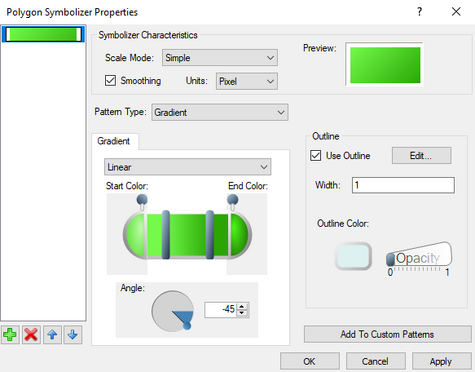
The Polygon Symbolizer Properties dialog is reached by clicking on the ![]() button on the Background properties line in the object properties section of the Layout Editor dialog. The dialog allows defining the appearance of an object in the layout editor. Each of them are discussed below.
button on the Background properties line in the object properties section of the Layout Editor dialog. The dialog allows defining the appearance of an object in the layout editor. Each of them are discussed below.
Property Layers List
On the left of the dialog is a list of currently defined property sets for the given object. The property sets are layered, allowing them to be combined if the opacity settings are set correctly. For example, a property set using the "Hatch" pattern type could be combined with a "Gradient" pattern type if desired.
Clicking the add ![]() button adds an additional property set layer to the list. The up and down arrow
button adds an additional property set layer to the list. The up and down arrow ![]() buttons move the selected property set layer above or below the other layers. The delete
buttons move the selected property set layer above or below the other layers. The delete ![]() button removes the selected property set layer. Note that if there is only one property set layer, it can not be deleted.
button removes the selected property set layer. Note that if there is only one property set layer, it can not be deleted.
Symbolizer Characteristics
This is the first section, at the top and to the right of the column showing the property set layers.
- Scale Model drop-down – Options include: "Simple", "Symbolic", and "Geographic".
- Smoothing check box – When checked, automatically adjusts the image values to present a cleaner image.
- Units drop-down – Options for units include: "Display", "Document", "Inch", "Millimeter", "Pixel", "Point", and "World".
- Preview – Shows how the color fill currently appears with the selected options.
Pattern
Any layout object can be filled with a solid color or a pattern.
- Pattern Type drop-down – A list with the following options:
- "Gradient" – Fills the polygon with a gradient color. Gradient options include:
- Gradient Type – Drop down menu with the following options:
- "Circular" – Creates the gradient by uniformly transitioning from the Surround Color at the edge of the object to the Central Color in the center of the object.
- "Linear" – Creates the gradient by uniformly transitioning from the Start Color into the End Color in the Angle direction.
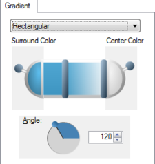
- "Rectangular" – Creates the gradient by uniformly transitioning by quarter from the Surround Color at the edges of the object to the Central Color in the Angle direction. This creates a four-pointed star effect with the two colors.
- Gradient Slider – Clicking and dragging the thick vertical bars on the slider adjusts how gradually the colors transition from one to the other in the gradient. Clicking on either end of the slider will bring up a Color dialog where the gradient colors can be selected. Moving the opacity slider levers at either end of the slider will adjust the opacity of the colors in the gradient.
- Angle – Rotate the gradient by entering the angle in the editable field, using the up and down arrows to change the angle, or dragging the small circular handle on the edge of the circle.
- Gradient Type – Drop down menu with the following options:
- "Picture" – Imports a picture to fill the polygon. Options include:
- Image – Clicking the
 button brings up a file browser where an image file (BMP, GIF, JPEG, PNG, TIFF, or ICO) can be specified for the polygon fill.
 - Tile mode – Options to tile the imported image.
- "Clamp" – Places a single copy of the imported image without repeating it.
- "Tile" – Repeats the image to file the entire object.
- "Tile Flip X" – Repeats the imported image by flipping the horizontal axis of every alternate image column.
- "Tile Flip XY" – Repeats the imported image by flipping the horizontal and vertical axis of every alternate instance of the image.
- "Tile Flip Y" – Repeats the imported image by flipping the vertical axis of every alternate image row.
- Angle – Rotates the image file by entering the angle in the editable field, using the up and down arrows to change the angle, or dragging the small circular handle on the edge of the circle.
- X Ratio – Increase (>1) or decrease (<1) the width of the imported image.
- Y Ratio – Increase (>1) or decrease (<1) the height of the imported image.
- Image – Clicking the
- "Simple" – Creates a solid color fill in the polygon with the following options:
- Fill Color – Specifies the color of the polygon. Clicking on this button brings up a Color dialog.
- Opacity – Moving the slider sets the opacity of the color fill. "0" equals no opacity or completely transparent. "1" equals a opacity of 100%.
- "Hatch" – Fills the polygon with the specified hatch pattern. Hatch patterns options include:
- Hatch Style drop-down – Provides a list of hatching styles.
- Foreground Color – Specifies the color of the foreground hatching. Clicking on this button brings up a Color dialog.
- Foreground Opacity – Moving the slider sets the opacity of the foreground hatching. "0" equals no opacity or completely transparent. "1" equals a opacity of 100%.
- Background Color – Specifies the color behind the hatching. Clicking on this button brings up a Color dialog.
- Background Opacity – Moving the slider sets the opacity of the color behind the hatching. "0" equals no opacity or completely transparent. "1" equals a opacity of 100%.
- "Gradient" – Fills the polygon with a gradient color. Gradient options include:
Outline
The layout object polygon can be given a border with following options:
- Use Outline check box – When checked on this creates a border around the layout object.
- Edit button – Clicking brings up the Line Symbol dialog.
- Width – Specifies the width of the border line in pixels.
- Outline Color – Sets the color of the border. Clicking on this button brings up a Color dialog.
- Opacity – Moving the slider sets the opacity of the border. "0" equals no opacity or completely transparent. "1" equals an opacity of 100%.
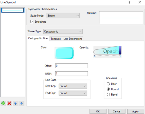
Line Symbol Dialog
This dialog provides additional options and parameters for a defined border.
- Layer List
- On the left of the dialog is an unlabeled list of currently-defined property sets for the given border. The property sets are layered, allowing the sets to be combined if the opacity settings are set correctly. Clicking the add
 button adds an additional layer to the list. The up and down arrow
  buttons move the selected layer above or below the other layers. The delete
  button removes the selected layer.
- On the left of the dialog is an unlabeled list of currently-defined property sets for the given border. The property sets are layered, allowing the sets to be combined if the opacity settings are set correctly. Clicking the add
- Characteristics
- Scale Model drop-down – Options include: "Simple", "Symbolic", and "Geographic".
- Smoothing check box – When checked, automatically adjusts the image values to present a cleaner image.
- Preview – Shows how the border line appears with the currently-selected options.
- Stroke Type
- "Simple" – A basic set of parameters for the border line, including:
- Color – Specifies the color of the border line. Clicking on this button brings up a Color dialog.
- Opacity – Moving the slider sets the opacity of the border line. "0" equals no opacity or completely transparent. "1" equals a opacity of 100%.
- Width – Specifies the thickness of the border line in pixels.
- Dash Style – Sets the line as a solid or dashed line. Options include: "Solid", "Dash", "Dot", "Dash Dot", "Dash Dot Dot", and "Custom".
- "Cartographic" – A more complex array of options for the border line. This option has three tabs with the following options:
- Cartographic Line – This tab has the following options:
- Color – Specifies the color of the border line. Clicking on this button brings up a Color dialog.
- Opacity – Moving the slider sets the opacity of the border line. "0" equals no opacity or completely transparent. "1" equals a opacity of 100%.
- Offset – Moves the line off of center. By default, the line length is equal on each side of the centerline. Both positive and negative values are accepted.
- Width – Specifies the thickness of the border line in pixels.
- Line Caps – Section includes options for both Start Cap and End Cap at each end of the line. Both options can be set to: "Flat", "Round", "Square", "Triangle", "No Anchor", "Square Anchor", "Round Anchor", "Diamond Anchor", "Arrow Anchor", "Anchor Mask", and "Custom".
- Line Joins – Section includes options for how the border line in a polygon meet. Options include" Miter, Round, and Bevel.
- Template – This tab presents a grid where the width and dash spacing can be specified. The width of the line can be increased by dragging the vertical arrow down or up. The line width can be separated into multiple lines by selecting a row to make it inactive and thus creating a space between lines. The horizontal arrow can be dragged left or right to increase the dash width. Spaces between dashes can be added by selecting a column to make it inactive.
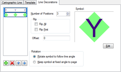
- Line Decorations – This tab has several options for specifying a symbol at the each line end. Options include:
- Layer List – On the left of the tab is an unlabeled list of currently-defined property sets for the line decoration. The property sets are layered, allowing the sets to be combined if the opacity settings and positioning are set correctly. Clicking the add
 button adds an additional layer to the list. The up and down arrow
  buttons move the selected layer above or below the other layers. The delete
  button removes the selected property set.
 - Position Options – Section allows defining the placement of the line decorations. Options include:
- Number of Positions – Specifies how often the line decoration symbol repeat along the border line.
- Flip All check box – Inverts the symbol position for all instances of the symbol on the line.
- Flip First check box – Inverts the symbol position for the first instance symbol on the line.
- Offset – Moves the symbol off of the line center. Both positive and negative values are accepted.
- Percentual position – Treats the entire line as 0% to 100% and sets the location of the symbol based on the percentage entered. This option is only visible when Number of Positions is set to "1".
- Rotation
- Rotate symbol to follow line angle
- Keep symbol at fixed angle to page
- Symbol – Gives a preview of the current symbol. Clicking the Edit button brings up the Point Symbolizer Dialog where the symbol decoration can be defined.
- Layer List – On the left of the tab is an unlabeled list of currently-defined property sets for the line decoration. The property sets are layered, allowing the sets to be combined if the opacity settings and positioning are set correctly. Clicking the add
- Cartographic Line – This tab has the following options:
- "Simple" – A basic set of parameters for the border line, including:
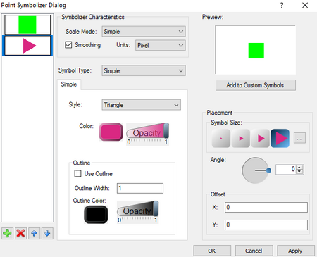
Point Symbolizer Dialog
Provides additional options for symbols when using the line decoration options in the Line Symbol dialog.
- Layer List
- On the left of the dialog is a list of currently defined property sets for the symbol. The property sets are layered, allowing the sets to be combined if the opacity settings are set correctly. Clicking the add
 button adds an additional layer to the list. The up and down arrow
  buttons move the selected layer above or below the other layers. The delete
  button removes the selected property set.
- On the left of the dialog is a list of currently defined property sets for the symbol. The property sets are layered, allowing the sets to be combined if the opacity settings are set correctly. Clicking the add
- Symbolizer Characteristics
- Scale Model drop-down – Options include: "Simple", "Symbolic", and "Geographic".
- Smoothing check box – When checked on, automatically adjusts the image values to present a cleaner image.
- Units drop-down – Options include: "Display", "Document", "Inch", "Millimeter", "Pixel", "Point", and "World".
- Preview – Shows how the symbol appears with the currently-selected options.
- Add to Custom Symbols button – Adds the symbol to the list of custom symbols.
- Symbol Type drop-down – Select the type of symbol desired:
- "Simple" – Uses a simple shape as the symbol. Options include:
- Style drop-down – Provides simple shapes. Options include: "Diamond", "Hexagon", "Ellipse", "Pentagon", "Rectangle", "Star", and "Triangle".
- Color – Specifies the color of the symbol. Clicking on this button brings up a Color dialog.
- Opacity – Moving the slider sets the opacity of the symbol. "0" equals no opacity or completely transparent. "1" equals a opacity of 100%.
- Use Outline check box – Checking this box places a line around the border of the symbol.
- Outline Width – Specifies the thickness of the border line in pixels.
- Outline Color – Specifies the color of the symbol border line. Clicking on this button brings up a Color dialog.
- Outline Opacity – Moving the slider sets the opacity of the symbol border line. "0" equals no opacity or completely transparent. "1" equals a opacity of 100%.
- "Character" – Uses a character as the symbol. Options include:
- Color – Specifies the color of the character symbol. Clicking on this button brings up a Color dialog.
- Opacity – Moving the slider sets the opacity of the character symbol. "0" equals no opacity or completely transparent. "1" equals a opacity of 100%.
- Font Family drop-down – A list of available fonts for the character symbol.
- Character Keyboard – A scrollable list of characters available for the selected font. Click on a character to use it.
- Unicode – Enter a unicode number to use a unicode character.
- "Picture" – Uses an image as the symbol. Options include:
- Image – Clicking the
 button brings up a file browser where an image file (BMP, GIF, JPEG, PNG, TIFF, or ICO) can be specified for the symbol.
 - Image Opacity – Moving the slider sets the opacity of the image. "0" equals no opacity or completely transparent. "1" equals a opacity of 100%.
- Use Outline check box – Checking this box places a line around the border of the symbol.
- Outline Width – Specifies the thickness of the border line in pixels.
- Outline Color – Specifies the color of the symbol border line. Clicking on this button will bring up a Color dialog.
- Outline Opacity – Moving the slider sets the opacity of the symbol border line. "0" equals no opacity or completely transparent. "1" equals a opacity of 100%.
- Image – Clicking the
- "Simple" – Uses a simple shape as the symbol. Options include:
- Placement
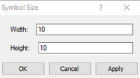
- Symbol Size – Provides four preset pixel sizes as buttons (from left to right): 4x4, 10.5x10.5, 17x17, and 30x30. Clicking the
 button brings up the Symbol Size dialog where the Width and Height of the symbol can be manually entered.
 - Angle – Rotates the image file by entering the angle in the editable field, using the up and down arrows to change the angle, or dragging the small circular handle on the edge of the circle.
- Offset – Adjusts the position of the symbol on the line by changing the X and Y fields. Both positive and negative values are accepted.
- Symbol Size – Provides four preset pixel sizes as buttons (from left to right): 4x4, 10.5x10.5, 17x17, and 30x30. Clicking the
Related Topics
GMS – Groundwater Modeling System | ||
|---|---|---|
| Modules: | 2D Grid • 2D Mesh • 2D Scatter Point • 3D Grid • 3D Mesh • 3D Scatter Point • Boreholes • GIS • Map • Solid • TINs • UGrids | |
| Models: | FEFLOW • FEMWATER • HydroGeoSphere • MODAEM • MODFLOW • MODPATH • mod-PATH3DU • MT3DMS • MT3D-USGS • PEST • PHT3D • RT3D • SEAM3D • SEAWAT • SEEP2D • T-PROGS • ZONEBUDGET | |
| Aquaveo | ||
SMS – Surface-water Modeling System | ||
|---|---|---|
| Modules: | 1D Grid • Cartesian Grid • Curvilinear Grid • GIS • Map • Mesh • Particle • Quadtree • Raster • Scatter • UGrid |  |
| General Models: | 3D Structure • FVCOM • Generic • PTM | |
| Coastal Models: | ADCIRC • BOUSS-2D • CGWAVE • CMS-Flow • CMS-Wave • GenCade • STWAVE • WAM | |
| Riverine/Estuarine Models: | AdH • HEC-RAS • HYDRO AS-2D • RMA2 • RMA4 • SRH-2D • TUFLOW • TUFLOW FV | |
| Aquaveo • SMS Tutorials • SMS Workflows | ||
