Polygon Symbolizer Properties: Difference between revisions
| Line 91: | Line 91: | ||
</blockquote> | </blockquote> | ||
*"Cartographic" | *"Cartographic" | ||
<blockquote> | |||
*''Cartographic Line'' | |||
*''Template'' | |||
*''Line Decorations'' | |||
</blockquote> | |||
</blockquote> | </blockquote> | ||
Revision as of 19:41, 30 November 2015
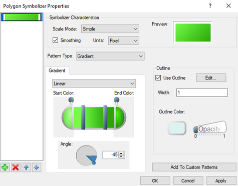
The Polygon Symbolizer Properties dialog is reached by clicking on the ![]() button in the Background properties of the Layout Editor dialog. The dialog allows defining the appearance of an object in the layout editor.
button in the Background properties of the Layout Editor dialog. The dialog allows defining the appearance of an object in the layout editor.
The dialog has the following properties:
Property Layers List
On the left of the dialog is a list of currently defined property sets for the given object. The property sets are layered allowed the sets to be combined if the opacity settings are set correctly. For example, a property set using the "Hatch" pattern type could be combined with a "Gradient" patter type if desired.
Clicking the add ![]() button will add an additional layer to the list. The up and down arrow
button will add an additional layer to the list. The up and down arrow ![]() buttons will move the selected layer above or below the other layers. The delete
buttons will move the selected layer above or below the other layers. The delete ![]() button will remove an unnecessary property set.
button will remove an unnecessary property set.
Symbolizer Characteristics
- Scale Model – Options include: "Simple", "Symbolic", and "Geographic".
- Smoothing – When checked on, automatically adjusts the image values to present a cleaner image.
- Units – Options for units include: "Display", "Document", "Inch", "Millimeter", "Pixel", "Point", and "World".
- Preview – Shows how the color fill currently appears with the selected options.
Pattern
Any layout object can be filled with a solid color or a pattern.
- Pattern Type – Drop down list with for options:
- "Gradient" – Fills the polygon with a gradient color. Gradient options include:
- Gradient Type – Drop down menu with the following options:
- "Circular" – Creates the gradient by blending the Surround Color into the Central Color going from the layout object center in uniform direction.
- "Linear" – Creates the gradient by blending the Start Color into the End Color in the Angle direction.
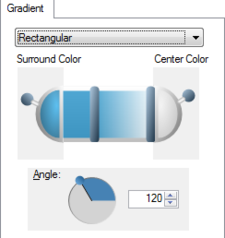
- "Rectangular" – Creates the gradient by blending the Surround Color into the Central Color going from the layout object edges inward in the Angle direction.
- Gradient Slider – Clicking on either of the bars on the slider can be used to adjust the color balance of the gradient. Clicking on either end of the slider will bring up a Color dialog where the gradient colors can be selected. Moving the levers at either end of the slider will adjust the opacity of the colors in the gradient.
- Angle – Rotates the image file by either setting the angle in the editable field or clicking and dragging on the circle.
- "Picture" – Imports a picture to fill the polygon. Options include:
- Image – Click the
button will bring up a file browser where an image file (BMP, GIF, JPEG, PNG, or TIFF) can be specified for the polygon fill.
- Tile mode – Options to tile the imported image.
- "Clamp" – Places a single copy of the imported image.
- "Tile" – Repeats the image to file the entire object.
- "Tile Flip X" – Repeats the imported image by flipping the horizontal axis of every alternate image column.
- "Tile Flip XY" – Repeats the imported image by flipping the horizontal and vertical axis of every alternate instance of the image.
- "Tile Flip Y" – Repeats the imported image by flipping the vertical axis of every alternate image row.
- Angle – Rotates the image file by either setting the angle in the editable field or clicking and dragging on the circle.
- X Ratio – Increase (>1) or decrease (<1) the width of the imported image.
- Y Ratio – Increase (>1) or decrease (<1) the height of the imported image.
- "Simple" – Creates a solid color fill in the polygon with the following options:
- Fill Color – Specifies the color of the polygon. Clicking on this button will bring up a Color dialog.
- Opacity – Moving the slider will set the opacity of the color fill. "0" equals no opacity or completely transparent. "1" equals a opacity of 100%.
- "Hatch" – Fills the polygon with the specified hatch pattern. Hatch patterns options include:
- Hatch Style
- Foreground Color – Specifies the color of the foreground hatching. Clicking on this button will bring up a Color dialog.
- Foreground Opacity – Moving the slider will set the opacity of the foreground hatching. "0" equals no opacity or completely transparent. "1" equals a opacity of 100%.
- Background Color – Specifies the color behind the hatching. Clicking on this button will bring up a Color dialog.
- Background Opacity – Moving the slider will set the opacity of the color behind the hatching. "0" equals no opacity or completely transparent. "1" equals a opacity of 100%.
Outline
The layout object polygon can be given a border with following options:
- Use Outline – When checked on this creates a border around the layout object.
- Edit – Clicking on this button will bring up the Line Symbol dialog.
- Width – Specifies the width of the border line in pixels.
- Outline Color – Sets the color of the border. Clicking on this button will bring up a Color dialog.
- Opacity – Moving the slider will set the opacity of the border. "0" equals no opacity or completely transparent. "1" equals a opacity of 100%.
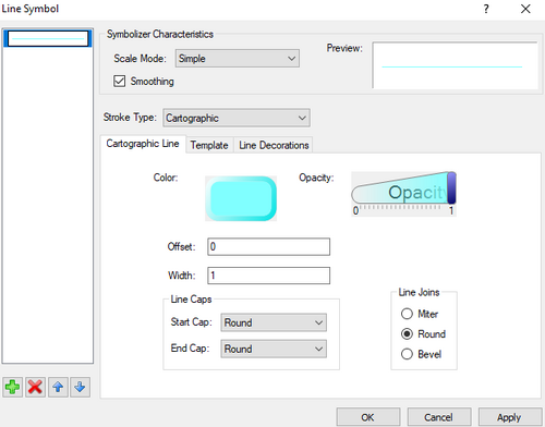
Line Symbol Dialog
This dialog provides additional options and parameters for a defined border.
- Property Layers
On the left of the dialog is a list of currently defined property sets for the given border. The property sets are layered allowed the sets to be combined if the opacity settings are set correctly. Clicking the add
button will add an additional layer to the list. The up and down arrow
buttons will move the selected layer above or below the other layers. The delete
button will remove an unnecessary property set.
- Characteristics
- Scale Model – Options include: "Simple", "Symbolic", and "Geographic".
- Smoothing – When checked on, automatically adjusts the image values to present a cleaner image.
- Preview – Shows how the border line currently appears with the selected options.
- Stroke Type
- "Simple"
- Fill Color – Specifies the color of the border line. Clicking on this button will bring up a Color dialog.
- Opacity – Moving the slider will set the opacity of the border line. "0" equals no opacity or completely transparent. "1" equals a opacity of 100%.
- Width – Specifies the thickness of the border line in pixels.
- Dash Style – Sets the line as a solid line or as a dashed line. Options include: "Solid", "Dash", "Dot", "Dash Dot", "Dash Dot Dot", and "Custom".
- "Cartographic"
- Cartographic Line
- Template
- Line Decorations
Custom Patterns
- Add To Custom Patterns
Related Topics
GMS – Groundwater Modeling System | ||
|---|---|---|
| Modules: | 2D Grid • 2D Mesh • 2D Scatter Point • 3D Grid • 3D Mesh • 3D Scatter Point • Boreholes • GIS • Map • Solid • TINs • UGrids | |
| Models: | FEFLOW • FEMWATER • HydroGeoSphere • MODAEM • MODFLOW • MODPATH • mod-PATH3DU • MT3DMS • MT3D-USGS • PEST • PHT3D • RT3D • SEAM3D • SEAWAT • SEEP2D • T-PROGS • ZONEBUDGET | |
| Aquaveo | ||
SMS – Surface-water Modeling System | ||
|---|---|---|
| Modules: | 1D Grid • Cartesian Grid • Curvilinear Grid • GIS • Map • Mesh • Particle • Quadtree • Raster • Scatter • UGrid |  |
| General Models: | 3D Structure • FVCOM • Generic • PTM | |
| Coastal Models: | ADCIRC • BOUSS-2D • CGWAVE • CMS-Flow • CMS-Wave • GenCade • STWAVE • WAM | |
| Riverine/Estuarine Models: | AdH • HEC-RAS • HYDRO AS-2D • RMA2 • RMA4 • SRH-2D • TUFLOW • TUFLOW FV | |
| Aquaveo • SMS Tutorials • SMS Workflows | ||


