SMS:Display Options: Difference between revisions
(→Points) |
|||
| Line 31: | Line 31: | ||
For each entity type, the dialog includes a toggle, and where appropriate, a button. If the toggle is selected, SMS will display the entity type. The buttons are of various types, as described below: | For each entity type, the dialog includes a toggle, and where appropriate, a button. If the toggle is selected, SMS will display the entity type. The buttons are of various types, as described below: | ||
=== Points === | === Points === | ||
If the display of an entity is focused around a single location, like a mesh node, the button displays a circle, drawn in the color that will be used to display that entity. To change the circle size, or color, click on the button and the ''Point Attributes'' dialog will appear. The color can also be changed by clicking on the combo box arrow next to the button. It is recommended that if there are many of points, and their position can be inferred from other displayed entities (such as the position of mesh nodes by the edges of the elements) that the symbols be turned off to increase efficiency. | If the display of an entity is focused around a single location, like a mesh node, the button displays a circle, drawn in the color that will be used to display that entity. To change the circle size, or color, click on the button and the ''Point Attributes'' dialog will appear. The color can also be changed by clicking on the combo box arrow [[File:Thin vertical drop-down arrow button icon.png]] next to the button. It is recommended that if there are many of points, and their position can be inferred from other displayed entities (such as the position of mesh nodes by the edges of the elements) that the symbols be turned off to increase efficiency. | ||
=== Symbols === | === Symbols === | ||
Revision as of 15:36, 2 November 2016
Display Options in SMS refers to the control of what entities are displayed, and how (color and style) they are displayed. Each entity in each module has its own display options. The display options for the active module are shown when the Display Options dialog opens.
The Display Options dialog is opened by any of the following methods:
- Right-clicking on any module folder in the Project Explorer and selecting the Display Options command from the right-click menu
- Using the Display | Display Options menu command
- Clicking the
 Display Options macro
 - Using the keyboard shortcut CTRL+D
Display Option Pages
SMS supports a display option page for general display options and for each type of data (i.e. 2D mesh, scatter sets, map data, ...) managed in a simulation. The display option dialog includes the option to set all options on all pages if desired. The toggle at the lower left of the dialog hides the option pages for data types that are not included in the current project. This toggle is selected by default and reduces the amount of information seen. The following display option pages exist:
- 1D Grid – This page controls the display options related to the coastal morphology model GenCade.
- 2D Mesh – This page controls the display options related to unstructured 2D meshes and the models (such as ADH and the generic model interface) that use them.
- Cartesian Grid – Controls the options related to Cartesian grids and the models (such as TUFLOW, CMS-Flow and BOUSS2D) that use them.
- Curvilinear Grid – Controls the options related to the curvilinear or boundary fitted grids and the models (such as LTFATE) that use them.
- General – Controls the general display options.
- GIS – Controls the display options related to GIS data using the internal GIS support in SMS. If ArcGIS is enabled inside of SMS, the ArcObjects display options control the display of these entities.
- Map – Controls the display options related to the map module (coverages) in SMS.
- Mesh – Controls the display options related to the general unstructured mesh objects.
- Particle – Controls the display options related to the PTM Lagrangian particle tracker model.
- Quadtree – Controls the display options related to the quadtree module in SMS.
- Raster – Controls the display options related to raster (or DEM) type objects.
- Scatter – Controls the display options related to scattered datasets (also referred to as Triangulated Irregular Networks or TINs).
Tabs
For each page, additional tabs may appear which specify the display settings for vectors or contours in that type of data. The General Display Options also includes separate tabs for Lighting Options and viewing control.
Functional Surfaces
For some types of data, it could be useful to display a surface of the datasets associated with the geometric data. For example, a computed water surface can be displayed as a surface to intuitively illustrate how a flooding scenario looks in three dimensions. Other datasets, which don't have such a direct connection to elevation can also be viewed as a functional surface to give insight to the situation. The options to set the functional surface for a specific geometric data type will appear in the page for that data type.
Entity Display Options
For each entity type, the dialog includes a toggle, and where appropriate, a button. If the toggle is selected, SMS will display the entity type. The buttons are of various types, as described below:
Points
If the display of an entity is focused around a single location, like a mesh node, the button displays a circle, drawn in the color that will be used to display that entity. To change the circle size, or color, click on the button and the Point Attributes dialog will appear. The color can also be changed by clicking on the combo box arrow ![]() next to the button. It is recommended that if there are many of points, and their position can be inferred from other displayed entities (such as the position of mesh nodes by the edges of the elements) that the symbols be turned off to increase efficiency.
next to the button. It is recommended that if there are many of points, and their position can be inferred from other displayed entities (such as the position of mesh nodes by the edges of the elements) that the symbols be turned off to increase efficiency.
Symbols
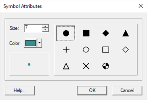
If the display of an entity is focused around a single location, like a scatter point, the button displays a symbol, drawn in the color that will be used to display that entity. To change the symbol, symbol size, or color, click on the button and the Symbol Attributes dialog will appear. The color can also be changed by clicking on the combo box arrow ![]() next to the button. It is recommended that if there are many of these entities, and their position can be inferred from other displayed entities (such as the position of scatter points by the edges of the scatter triangles) that the symbols be turned off to increase efficiency.
next to the button. It is recommended that if there are many of these entities, and their position can be inferred from other displayed entities (such as the position of scatter points by the edges of the scatter triangles) that the symbols be turned off to increase efficiency.
Line
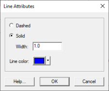
If the entity to be displayed encloses a region, such as a triangle or element, the button displays a sample line drawn in the color and width that will be used to display the line around the edge of that entity. To change the color and/or width, click on the button and the Line Attributes dialog will appear. This allows selecting a line style (dashed or solid), a width (in pixels) and a color. The color can also be changed by clicking on the combo box arrow ![]() next to the button.
next to the button.
Font
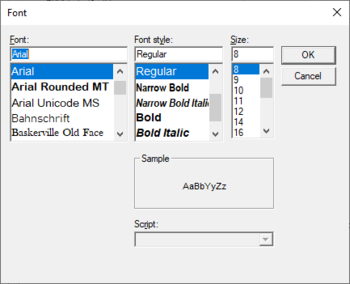
If the entity to be displayed is a text string, such as the node id, the button displays a sample string ("AaBb") drawn in the color and font that will be used to display the string. To change the font, click on the button and the Font dialog will appear. The color can be changed by clicking on the combo box arrow ![]() next to the button.
next to the button.
Color
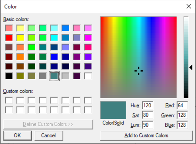
If the entity has only a color associated with it, the button displays a square, drawn in the color that will be used to display that entity. To change the color, click on the button, and the Color dialog will appear. The color can also be changed by clicking on the combo box arrow ![]() next to the button.
next to the button.
Options
Other specific display attributes can be accessed through the Options buttons. The options available will vary based on the current model and includes attributes such as boundary conditions assigned to nodes or nodestrings.
Related Topics
SMS Display Options | |
|---|---|
| Modules | Mesh Module • Cartesian Grid Module • 3D Cartesian Grid Module • Scatter Module • Map Module • GIS Module • Particle Module |
| Datasets | Contour Options • Vector Options |
SMS – Surface-water Modeling System | ||
|---|---|---|
| Modules: | 1D Grid • Cartesian Grid • Curvilinear Grid • GIS • Map • Mesh • Particle • Quadtree • Raster • Scatter • UGrid |  |
| General Models: | 3D Structure • FVCOM • Generic • PTM | |
| Coastal Models: | ADCIRC • BOUSS-2D • CGWAVE • CMS-Flow • CMS-Wave • GenCade • STWAVE • WAM | |
| Riverine/Estuarine Models: | AdH • HEC-RAS • HYDRO AS-2D • RMA2 • RMA4 • SRH-2D • TUFLOW • TUFLOW FV | |
| Aquaveo • SMS Tutorials • SMS Workflows | ||


