GMS:Feature Object Display Options: Difference between revisions

From XMS Wiki
Jump to navigationJump to search
(update image)
No edit summary
 
(15 intermediate revisions by 3 users not shown)
Line 1: Line 1:
{{Map links}}
{{Map links}}
The properties of all feature object and coverage data that GMS displays on the screen can be controlled through the ''Map'' tab of the ''Display Options'' dialog. This dialog is opened by right-clicking on the [[Image:MapFolder.GIF]] Map Data entry in the [[GMS:Project Explorer|Project Explorer]] and selecting the '''Display Options''' command. It can also be accessed from the from the ''Display'' menu or the [[File:Display Options macro.png]] '''Display Options''' macro. The objects on the left of the dialog are common to all coverages, regardless of the coverage type, and are always available in the ''Display Options'' dialog. The options on the right of the dialog depend on the coverage type. The following table describes the general display options available for the Map module.
The properties of all feature object and coverage data that GMS displays on the screen can be controlled through the ''Map'' tab of the ''Display Options'' dialog. This dialog is opened by right-clicking on the "[[File:Map Folder.svg|16 px]] Map Data" entry in the [[GMS:Project Explorer|Project Explorer]] and selecting the '''Display Options''' command. It can also be accessed from the from the ''Display'' menu or the '''Display Options''' [[File:Display Options Macro.svg|16 px]] macro. The objects on the left of the dialog are common to all coverages, regardless of the coverage type, and are almost always available in the ''Display Options'' dialog.  However, some of these objects are hidden when certain types of coverages are active. The options on the right of the dialog depend on the coverage type. The coverage type can be adjusted using the drop-down menu on the top right of the dialog. The options in this drop-down menu change according to the coverages present in the project. Note that viewing all the options in the table on the right of the dialog might require adjusting the size of the ''Display Options'' dialog. The following table describes the general display options available for the Map module.


{| class="wikitable"
! width="125" | Display Option !! Description
|-
|-
| ID || If this option is selected, the ID of each of the feature objects is displayed next to the object. The graphical attributes of the text used to display the IDs are edited using the fields on the right side of the dialog.
| ID || Displays the ID of each of the feature objects next to the object. Note that there are four ''ID'' checkboxes, one for each feature object that can have IDs displayed. For three of the feature objects, the graphical attributes of the text used to display the IDs are edited using the fields on the right side of the dialog. However, for the ''Nodes'' feature object type, the options are accessed through the box to the right of the Nodes ''ID'' checkbox.
|-
|-
| Labels || If this option is selected, the name of points is displayed next to the object. The graphical attributes of the text used to display the Labels are edited using the fields on the right side of the dialog.
| Labels || Displays the name of points next to the object. Note that there are three ''Label'' checkboxes, one for each feature object that can have labels displayed. The graphical attributes of the text used to display the Labels are edited using the fields on the right side of the dialog.
|-
|-
| Points || This option is used to display points. The graphical attributes of the points (symbol, color, size, etc.) depend on the coverage type and are edited using the fields on the right side of the dialog.
| Points || Displays points. The graphical attributes of the points (symbol, color, size, etc.) depend on the coverage type and the BC type of the individual point. They are edited using the fields on the right side of the dialog in the ''Points'' column.
|-
|-
| Nodes || This option is used to display nodes. The graphical attributes of the nodes (symbol, color, size, etc.) depend on the coverage type and are edited using the fields on the right side of the dialog.
| Nodes || Displays nodes. The graphical attributes of the nodes (symbol, color, size, etc.) depend on the coverage type and the BC type of the individual node. They are edited using the fields on the right side of the dialog in the ''Points'' column.
|-
|-
| Vertices || This option is used to display the vertices of arcs. A small dot is placed on the arcs at the location of each of the vertices. The color of the vertices is the same as the color of the arcs.
| Arcs || Displays arcs. The graphical attributes of the arcs (color, line style, thickness, etc.) depend on the coverage type and the BC type of the individual arc. They are edited using the fields on the right side of the dialog in the ''Arcs'' column.
|-
|-
| Arcs || This option is used to display arcs. The graphical attributes of the arcs (color, line style, thickness, etc.) depend on the coverage type and are edited using the fields on the right side of the dialog.
| Polygons (fill) || Displays polygons with fill color. The graphical attributes of the polygons (fill color) depend on the coverage type and the BC type of the individual polygon. They are edited using the fields on the right side of the dialog in the ''Polygons'' column. The Polygon fill can also be specified as an attribute.
 
Transparency can be set on the polygon fill using the edit box below the option.
|-
|-
| Polygons (fill) || If this option is selected, polygons are displayed filled. The graphical attributes of the polygons (fill color) depend on the coverage type and are edited using the fields on the right side of the dialog. The Polygon fill can also be specified as an attribute.
| Vertices || Displays the vertices of arcs. A small dot is placed on the arcs at the location of each of the vertices. The color of the vertices is the same as the color of the arcs.  
 
Transparency can also be set on the polygon fill using the edit box below the option.
|-
|-
| Legend || The ''Legend'' item can be used to display a legend listing each of the feature object types being displayed and showing what graphical attributes (symbol, line style, fill color and pattern) are being used to display each type.
| Legend || Displays a legend listing each of the feature object types being displayed and showing what graphical attributes (symbol, line style, fill color, and pattern) are being used to display each type. The legend only appears when feature objects in the active coverage have specificied BC types assigned to them (well, drain, specified head, etc.). The legend only includes feature object symbols with specificied BC types.
|-
|-
| Grid frame || This option is used to toggle the display of the Grid Frame.
| Grid frame || Displays the Grid Frame.
|-
|-
| Show inactive coverages || When several coverages are present, the display of coverages can become confusing. The user can choose to not display inactive coverages or change the color attributes on inactive coverages
| Show inactive coverages || When several coverages are present, the display of coverages can become confusing. The user can choose to not display inactive coverages or change the color attributes on inactive coverages. To be visible in the Graphics Window, coverages still need to be turned on in the Project Explorer regardless of the options selected here.
 
Each of the feature objects in a coverage has a set of display options (color, line style, etc.) that can be edited in the ''Display Options'' dialog. However, these colors are primarily used to display the objects in the active coverage. Objects in inactive coverages that are still visible can be displayed using one of two options:
*Coverage colors – Displays all visible feature objects from inactive coverages in the colors normally assigned to them. The display still prioritizes the active coverage.
*Inactive coverage – Allows for selecting a specific color for the display of visible items in all inactive coverages.


Each of the feature objects in a coverage has a set of display options (color, line style, etc.) that can be edited in the ''Display Options'' dialog. However, these colors are only used to display the objects in the active coverage. All of the objects in the inactive coverages are displayed using either Coverage colors or the Inactive coverage color depending on the selected option.
The display might not immediately adjust after these options are changed. Changing the display may require selecting a new active coverage in the Project Explorer.  
|-
|-
| Arc direction arrows || This option controls the display of an arrow which shows the [[GMS:Feature Objects#Arcs|arc direction]]. The pixel length of the arrow can be specified.
| Arc direction arrows || Displays an arrow which shows the [[GMS:Feature Objects#Arcs|arc direction]]. The pixel length of the arrow can be specified. Changing the display may require using the [[File:Zoom Tool Icon.svg|16 px]] '''Zoom Tool''' or changing which coverage is active.
|-
|-
| Well screens || This options controls the display of the well screens. The width of the well screen can be adjusted in the Width edit field below the toggle.
| Well screens || Displays [[GMS:MNW2 Package#Conceptual_Model|well screens]]. The width of the well screen can be adjusted in the ''Width'' edit field below the option.
|-
|-
| Segment ID || This option controls the display of the segments IDs. The font color and size for the segment can also be adjusted.
| Segment ID || Displays [[GMS:STR/SFR Packages#STR_Package|segment IDs]]. The font color, style, and size for the segment ID can also be adjusted.
|-
|-
| Calibration targets || This option controls the display of the calibration targets used in the model calibration process. Calibration targets are drawn next to their corresponding map data (point, arc, polygon).  
| Calibration targets || This option controls the display of the calibration targets used in the model calibration process. Calibration targets are drawn next to their corresponding map data (point, arc, polygon).  


The [[GMS:Calibration Targets| calibration target]] is drawn such that the height of the target is equal to twice the confidence interval (+ interval on top, − interval on bottom). The ''Scale'' edit field allows the user to change the general length and width of the targets independent of the range of the active dataset.
|-
| ||{{Version GMS 10.1}}
|-
|-
|MODFLOW targets || This option controls which active dataset (either the active 3D Grid dataset or the active UGrid dataset) is used for the display of the MODFLOW calibration targets.
|MODFLOW targets || This option controls which active dataset (either the active 3D Grid dataset or the active UGrid dataset) is used for the display of the MODFLOW calibration targets.
|}
|}


[[File:DisplayMap.jpg|thumb|none|left|500 px|The ''Display Options'' dialog showing the ''Map'' tab.]]
[[File:DisplayMap.png|thumb|none|left|500 px|The ''Display Options'' dialog showing the ''Map'' tab.]]


{{Navbox GMS}}
{{Navbox GMS}}
[[Category:Feature Objects]]
[[Category:Feature Objects|Dis]]
[[Category:GMS Display Options]]
[[Category:GMS Display Options]]
[[Category:GMS Dialogs|F]]
[[Category:GMS Display Dialogs]]
[[Category:GMS Map Dialogs|dis]]

Latest revision as of 19:32, 26 April 2022

Map Module
Easttex.jpg
Map
Feature Objects
Conceptual Model
Coverages
Clean Command
Grid Frame
Map to Models
Map to Modules
More
Feature Object Display Options
Feature Object Tool Palette
GIS Module
Images
Map Module Commands

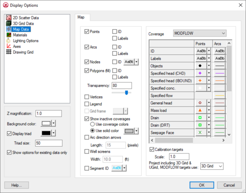
The properties of all feature object and coverage data that GMS displays on the screen can be controlled through the Map tab of the Display Options dialog. This dialog is opened by right-clicking on the "Map Folder.svg Map Data" entry in the Project Explorer and selecting the Display Options command. It can also be accessed from the from the Display menu or the Display Options Display Options Macro.svg macro. The objects on the left of the dialog are common to all coverages, regardless of the coverage type, and are almost always available in the Display Options dialog. However, some of these objects are hidden when certain types of coverages are active. The options on the right of the dialog depend on the coverage type. The coverage type can be adjusted using the drop-down menu on the top right of the dialog. The options in this drop-down menu change according to the coverages present in the project. Note that viewing all the options in the table on the right of the dialog might require adjusting the size of the Display Options dialog. The following table describes the general display options available for the Map module.

Display Option Description
ID Displays the ID of each of the feature objects next to the object. Note that there are four ID checkboxes, one for each feature object that can have IDs displayed. For three of the feature objects, the graphical attributes of the text used to display the IDs are edited using the fields on the right side of the dialog. However, for the Nodes feature object type, the options are accessed through the box to the right of the Nodes ID checkbox.
Labels Displays the name of points next to the object. Note that there are three Label checkboxes, one for each feature object that can have labels displayed. The graphical attributes of the text used to display the Labels are edited using the fields on the right side of the dialog.
Points Displays points. The graphical attributes of the points (symbol, color, size, etc.) depend on the coverage type and the BC type of the individual point. They are edited using the fields on the right side of the dialog in the Points column.
Nodes Displays nodes. The graphical attributes of the nodes (symbol, color, size, etc.) depend on the coverage type and the BC type of the individual node. They are edited using the fields on the right side of the dialog in the Points column.
Arcs Displays arcs. The graphical attributes of the arcs (color, line style, thickness, etc.) depend on the coverage type and the BC type of the individual arc. They are edited using the fields on the right side of the dialog in the Arcs column.
Polygons (fill) Displays polygons with fill color. The graphical attributes of the polygons (fill color) depend on the coverage type and the BC type of the individual polygon. They are edited using the fields on the right side of the dialog in the Polygons column. The Polygon fill can also be specified as an attribute.

Transparency can be set on the polygon fill using the edit box below the option.

Vertices Displays the vertices of arcs. A small dot is placed on the arcs at the location of each of the vertices. The color of the vertices is the same as the color of the arcs.
Legend Displays a legend listing each of the feature object types being displayed and showing what graphical attributes (symbol, line style, fill color, and pattern) are being used to display each type. The legend only appears when feature objects in the active coverage have specificied BC types assigned to them (well, drain, specified head, etc.). The legend only includes feature object symbols with specificied BC types.
Grid frame Displays the Grid Frame.
Show inactive coverages When several coverages are present, the display of coverages can become confusing. The user can choose to not display inactive coverages or change the color attributes on inactive coverages. To be visible in the Graphics Window, coverages still need to be turned on in the Project Explorer regardless of the options selected here.

Each of the feature objects in a coverage has a set of display options (color, line style, etc.) that can be edited in the Display Options dialog. However, these colors are primarily used to display the objects in the active coverage. Objects in inactive coverages that are still visible can be displayed using one of two options:

  • Coverage colors – Displays all visible feature objects from inactive coverages in the colors normally assigned to them. The display still prioritizes the active coverage.
  • Inactive coverage – Allows for selecting a specific color for the display of visible items in all inactive coverages.

The display might not immediately adjust after these options are changed. Changing the display may require selecting a new active coverage in the Project Explorer.

Arc direction arrows Displays an arrow which shows the arc direction. The pixel length of the arrow can be specified. Changing the display may require using the Zoom Tool Icon.svg Zoom Tool or changing which coverage is active.
Well screens Displays well screens. The width of the well screen can be adjusted in the Width edit field below the option.
Segment ID Displays segment IDs. The font color, style, and size for the segment ID can also be adjusted.
Calibration targets This option controls the display of the calibration targets used in the model calibration process. Calibration targets are drawn next to their corresponding map data (point, arc, polygon).

The calibration target is drawn such that the height of the target is equal to twice the confidence interval (+ interval on top, − interval on bottom). The Scale edit field allows the user to change the general length and width of the targets independent of the range of the active dataset.

MODFLOW targets This option controls which active dataset (either the active 3D Grid dataset or the active UGrid dataset) is used for the display of the MODFLOW calibration targets.
The Display Options dialog showing the Map tab.