XMS Print Layout
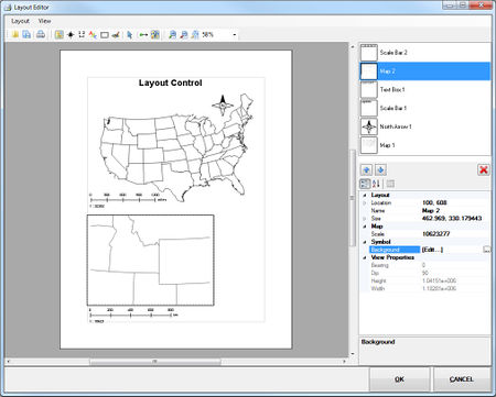
The layout tool helps to bring up the current view(s) of the XMS window along with its view parameters. User needs to go to File menu and choose Layout menu item to get the Layout Editor window.
Layout Editor Description
Below is a brief explanation of the Layout Editor dialog's macros, tools, and menus.
Document Toolbar
- Import
 – Opens a saved layout (*.mwl)
 - Export
 – Saves the layout in a user specific folder.
 - Print
 – Prints the layout.
Insert Toolbar
- Insert map
 – Inserts the map control to layout control. It brings the current view of the screen from XMS window.
 - Insert north arrow
 – Adds a north arrow to the selected map control.
 - Insert scale bar
 – Inserts a scale bar to the selected the map control
 - Insert Text:
 – Inserts a text box.
 - Insert rectangle
 – Inserts a rectangle on the layout
 - Insert Bitmap
 – Inserts a bitmap on the layout control.
 - 'Select Tool

Zoom Toolbar
- Update view
 – Updates the selected map control based on the current view from XMS window.
 - Zoom map to full extend
 – Extends the layout image object ( to full extend. The object will be extended in full when the image is first brought in. If the Size or Scale properties are changed for the layout object, then this command can be used to adjust how the image fits.
 - Zoom in
 – Zooms in on the layout control.
 - Zoom out
 – Zooms out from the layout control.
 - Fit to screen
 – Changes the layout control to fit to screen.
 - Percentage field – Changes the the given zoom level.
Layout Editor Menus
File menu items:
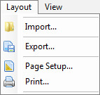
- Import – Opens the saved layout.
- Export – Saves the layout in a user specified folder.
- Page Setup – This brings up the page setup dialog box.
- Print – Prints the current layout.
View menu items:
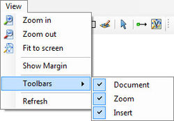
- Zoom in – Increases the size of the paper view region from layout control.
- Zoom out – Decreases the size of the paper view region from layout control.
- Fit to screen – Fits the screen paper view area based on layout control size.
- Show margins – Shows the margins of the paper control.
- Toolbars – Submenu with commands to enable or disable the Document, Insert, or Zoom toolbars.
- Refresh – Redraws the layout control.
When the user closes the layout it gets stored in the temporary folder of the current process. However, when the project gets stored the layout file contents moved to saved projected file under "Layout" node.
When opening a saved project and if the project doesn't have a layout, it brings up an empty layout. But, if the project already have a layout, it shows the saved layout.
Layout Controls
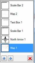
After inserting any object into the Layout Editor, the object can be selected using the section in the upper right portion of the window. This section displays all objects that have been inserted into the layout. Select an object to make it active by clicking directly on the listed object or using the up or down arrows to cycle through each object in the list. Selecting the delete button will remove the object from the layout.
Object Properties
The lower right portion of the Layout Editor shows the properties of the active object in the Layout Controls section. The properties can be sorted using the following command buttons:
- Categorize
 – Places the properties in categories such as "Layout", "Map", and "Symbol". The options in each category relate to the category title.
 - Alphabetical
 – Displays all properties alphabetically from A&ndashZ without grouping them into categories.
 - Property Pages
General Properties
All objects have the following properties in common:
- Location – This field present two numbers. The first number is the X-axis location of the object. Increasing the X number moves the object to the right. The second number is the Y-axis location of the object. Increasing the Y number moves the object down. This property can be expanded to more clearly see the X and Y numbers.
- Name – This field shows the current selected object name. The field is editable.
- Size – This field present two numbers. The first number is the width of the object. Increasing the Width number expands the object to the right and decreasing the number reduces the object towards the left edge. The second number is height of the object. Increasing the Height number expands the object down and decreasing the number reduces the object towards the top edge. This property can be expanded to more clearly see the Width and Height numbers.
- Background – Clicking on the
 button in this field, the Polygon Symbolizer Properties dialog is brought up.
Map
The Insert map ![]() tool is used to place the current image in Graphics Window into the Layout Editor. The tool is used by clicking and dragging in the Layout Editor to define the area where the map will be displayed. The editor will automatically resize and scale the image to the defined area.
tool is used to place the current image in Graphics Window into the Layout Editor. The tool is used by clicking and dragging in the Layout Editor to define the area where the map will be displayed. The editor will automatically resize and scale the image to the defined area.
The display of the editor can further be edited by adjusting the map properties. The map objects use general properties and the follow map object specific properties:
- Scale
- Bearing
- Dip
- Heigth
- Width
North Arrow
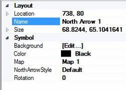
The north arrow binds with the specific map control. When a map gets rotated the north arrow changes its rotation angle based on the map's bearing angle. The following are the properties of the north arrow:
- Color
- Map – This field contains a dropdown list of all map objects in the Layout Editor. Selecting a map object assigns the north arrow to that map. When assigned, the arrow will rotate to match show north on the map.
- North Arrow Style
- Rotation
Scale Bar
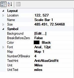
The scale bar also connected with map controls. Users are able to choose the scale of the scale bar and also change the map controls. The following are the properties of the scale bar:
- Break Before Zero
- Color
- Font
- Map – This field contains a dropdown list of all map objects in the Layout Editor. Selecting a map object assigns the scale bar to that map. When assigned, the scale bar will adjust to fit the scale of the map.
- Number of Breaks
- Text Hint
- Unit
- Unit text
The scale bar doesn't support geographic degrees and also if the dip is not equal to 0° or 90°, the scale bar doesn't show any scales.
Text
- Color
- Continent Alignment
- Font
- Text
- Text Hint
Rectangle
Rectangles created in the Layout Editor use general properties only and do not have specific properties.
Image
- Brightness
- Contrast
- File Name
- Preserve Aspect Ration
Related Topics
GMS – Groundwater Modeling System | ||
|---|---|---|
| Modules: | 2D Grid • 2D Mesh • 2D Scatter Point • 3D Grid • 3D Mesh • 3D Scatter Point • Boreholes • GIS • Map • Solid • TINs • UGrids | |
| Models: | FEFLOW • FEMWATER • HydroGeoSphere • MODAEM • MODFLOW • MODPATH • mod-PATH3DU • MT3DMS • MT3D-USGS • PEST • PHT3D • RT3D • SEAM3D • SEAWAT • SEEP2D • T-PROGS • ZONEBUDGET | |
| Aquaveo | ||
SMS – Surface-water Modeling System | ||
|---|---|---|
| Modules: | 1D Grid • Cartesian Grid • Curvilinear Grid • GIS • Map • Mesh • Particle • Quadtree • Raster • Scatter • UGrid |  |
| General Models: | 3D Structure • FVCOM • Generic • PTM | |
| Coastal Models: | ADCIRC • BOUSS-2D • CGWAVE • CMS-Flow • CMS-Wave • GenCade • STWAVE • WAM | |
| Riverine/Estuarine Models: | AdH • HEC-RAS • HYDRO AS-2D • RMA2 • RMA4 • SRH-2D • TUFLOW • TUFLOW FV | |
| Aquaveo • SMS Tutorials • SMS Workflows | ||
