GMS:MF6 GWT Model: Difference between revisions

From XMS Wiki
Jump to navigationJump to search
(Created page with "__NOINDEX__ {{Version GMS 10.6}} {{MODFLOW 6 Beta}} {{MODFLOW 6 Links}} File:MF6-GWT package.png|thumb|500px|right|The ''Groundwater Transport (GWT) Model Name File'' dialog...")
 
Line 20: Line 20:
** ''pname'' – This column represents the pname values, which are the Project Explorer item names of the packages (these cannot be changed in the spreadsheet).


==MODFLOW 6 GWF/GWT Display Options==
==GWT Display Options==
[[File:MF6-GWF-GWT Display Options.png|thumb|500px|right|The GWF/GWT ''Display Options'' dialog]]
[[File:MF6-GWF-GWT Display Options.png|thumb|500px|right|The GWF/GWT ''Display Options'' dialog]]
The GWF/GWT ''Display Options'' dialog is accessed by right-clicking on a GWT model under a MODFLOW 6 simulation in the Project Explorer. It contains the following:
Line 59: Line 59:
***''Writing System'' – This drop-down contains a list of different writing systems that the font settings can be applied to. The "Any" option will allow for the font settings to be applied to any potential writing system.
***''Sample'' – This box displays a preview sample of what the font will look like.


==Related Topics==
==Related Topics==

Revision as of 23:04, 5 October 2021

MODFLOW 6
Models & Tools
GWF Model
GWT Model
Cell Properties Dialog
Zone File
Packages
Flow: GNC, HFB, NPF
GWF: BUY, CHD, CSUB,
DRN, EVT, GHB,
LAK, MAW, MVR,
OBS, RCH,RIV,
SFR, STO, UZF,
WEL
GWT: ADV, CNC, DSP
FMI, IC, IST, LKT,
MDT, MST, MVT,
MWT, OBS, SFT,
SRC,SSM, UZT
Other DIS, DISU, DISV,
IMS, OC, TDIS,
PEST

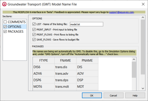
The Groundwater Transport (GWT) Model Name File dialog

The Groundwater Transport (GWT) Model Name File dialog is accessed by double-clicking on the GWT model under a MODFLOW 6 simulation in the Project Explorer. It contains the following sections and options:

  • Sections list – A list of sections that can be turned on or off:
    • COMMENTS – Turn on to make the COMMENTS section visible.
    • OPTIONS – Turn on to make the OPTIONS section visible.
    • PACKAGES – Turn on to make the PACKAGES section visible.
  • COMMENTS section – Enter general alphanumeric comments. Comments entered here get written at the top of the file, preceded by a '#' symbol.
  • OPTIONS section – Options and settings:
    • LIST – This allows a name for the listing file to be entered.
    • PRINT_INPUT – This indicates that the list of input will be printed to the listing file immediately after it is read.
    • PRINT_FLOWS – This indicates that the list of flow rates will be printed to the listing file.
    • SAVE_FLOWS – This indicates that flow terms will be saved to a budget file.
  • PACKAGES section – This deals with the PACKAGES block.
    • ftype – This column represents the ftype values, which are the file types of each entry.
    • fname – This column represents the fname values, which are the names of the files containing flows.
    • pname – This column represents the pname values, which are the Project Explorer item names of the packages (these cannot be changed in the spreadsheet).

GWT Display Options

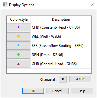
The GWF/GWT Display Options dialog

The GWF/GWT Display Options dialog is accessed by right-clicking on a GWT model under a MODFLOW 6 simulation in the Project Explorer. It contains the following:

  • Spreadsheet – This contains three columns involved in setting the display options for the GWF model.
    • Checkbox – These checkboxes can be used to activate or de-activate if a certain display aspect will be used.
    • Color/style – Clicking this button will bring up a Symbol Attributes dialog. This dialog has multiple options for changing the font:
      • Size – This numeric updown can be used to change the size of the symbols.
      • Color – There are two options here for changing the color of a symbol. One is a drop-down that brings a small window containing potential colors that can be chosen and a More Colors... button. Either pressing the button in this window, or pressing the button next to the Color text will bring up a Select Color dialog. This dialog has multiple options for changing the colors:
        • Basic colors – This contains a grid of pre-defined colors that can be selected for use.
        • Pick Screen Color – Clicking this button allows any color present on the screen to be selected for use. The cursor will change shape to a + symbol, and additional text will populate below the button while it is being used. The first line contains information about the spatial coordinates of the cursor's current location. The second line indicates that pressing the ESC key will cancel out of this operation.
        • Custom colors – This contains a grid of user-defined colors that can be selected for use. These may all be empty if none have yet been defined.
        • Add to Custom Colors – This will add the color that is currently defined to the grid of Custom colors, at the position that had last been selected by the user.
        • Color Selection Window – This window allows a cursor to be dragged across a gradient to select a color. In addition, there is a smaller spectrum to the right that can be dragged across to select how light/dark the color will be in value, and a preview window that displays what the color will look like.
        • Hue – This numeric updown can be used to specifically define the hue for the color.
        • Sat – This numeric updown can be used to specifically define the saturation for the color.
        • Val – This numeric updown can be used to specifically define the value for the color.
        • Red – This numeric updown can be used to specifically define the Red value for the color.
        • Green – This numeric updown can be used to specifically define the Green value for the color.
        • Blue – This numeric updown can be used to specifically define the Blue value for the color.
        • HTML – This textbox can be used to specifically define the HTML code for the color.
      • Shape Buttons – These buttons can be used to change the shape of the symbol and how it will be filled in.
      • Sample Space – This space displays a preview sample of what the symbol will look like.
    • Description – This textbox (not editable) describes what is being represented for a specific row.
  • All On – This will activate the checkboxes for all items in the spreadsheet.
  • All Off – This will de-activate the checkboxes for all items in the spreadsheet.
  • Change all – Next to this text are two buttons that can be used to change either all the symbols or all the text.
    • Black Dot – Clicking this button will bring up a Symbol Attributes dialog. Changes made to the symbol here will apply to all the display aspects in the spreadsheet. This dialog has multiple options for changing the font:
      • Size – This numeric updown can be used to change the size of the symbols.
      • Shape Buttons – These buttons can be used to change the shape of the symbol and how it will be filled in.
      • Sample Space – This space displays a preview sample of what the symbol will look like.
    • AaBb – Clicking this button will bring up a Select Font dialog. Changes made to the font here will apply to all the display aspects in the spreadsheet. This dialog has multiple options for changing the font:
      • Font – This contains a list with all of the available options for fonts. When one has been selected, it will be highlighted in the list and populate in the textbox above the list.
      • Font style – This contains a list with all of the available options for font stylings (ex. Regular, Bold, etc.). When one has been selected, it will be highlighted in the list and populate in the textbox above the list.
      • Size – This contains a list with all of the available options for sizes. When one has been selected, it will be highlighted in the list and populate in the textbox above the list.
      • Effects – This section contains a few options that can be activated or de-activated via checkbox:
        • Strikeout – This will automatically apply a strikeout through the text.
        • Underline – This will automatically apply an underline under the text.
      • Writing System – This drop-down contains a list of different writing systems that the font settings can be applied to. The "Any" option will allow for the font settings to be applied to any potential writing system.
      • Sample – This box displays a preview sample of what the font will look like.

Related Topics